W3’s Web Content Accessibility Guidelines (WCAG) are one of the most important guides to creating accessible websites, but they can often be a bit opaque. Today we’re taking a look at them in plain English, so you can spend less time reading, and more time making great websites.
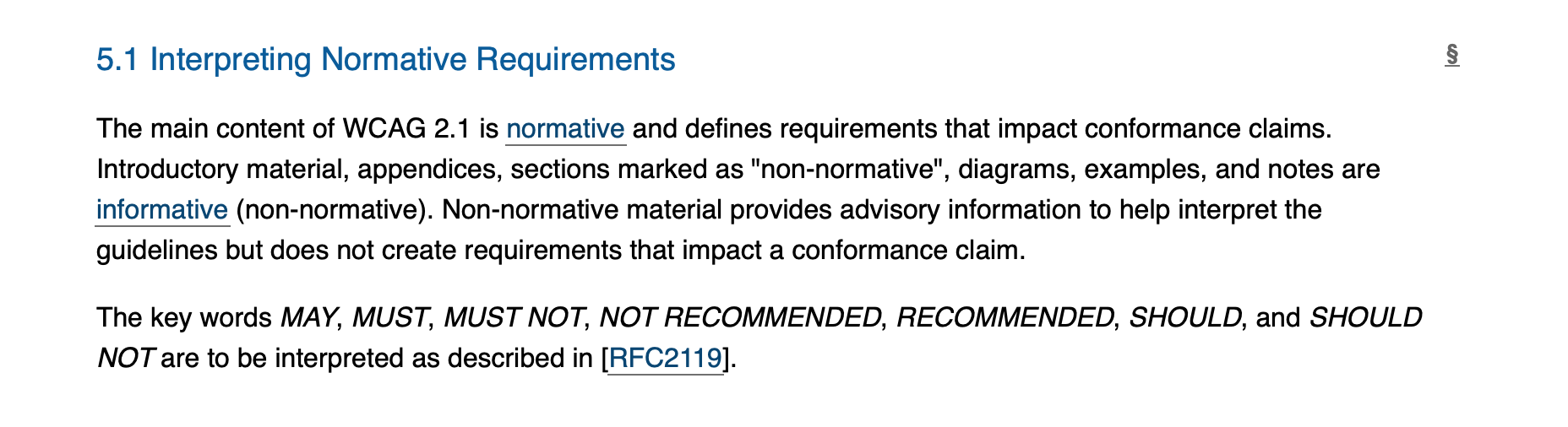
WCAG 2.1 came out in June 2018, and the internet has been slowly making the necessary compliance changes. A big part of the reason it’s been slow to reach the net is because, well … WCAG. It’s somewhere between a legal document and an academic text, and a lot of developers see paragraphs like this and check out entirely:
But don’t worry: I’ve dealt with many projects made to be WCAG compliant, and this sort of thing is my bread and butter. Today I’m going to be breaking down WCAG 2.1 for the UX developer who wants to improve site accessibility without having to go away and do a law degree. This is going to be a fairly long post, but—if I’ve done my job—one that should be easy for anybody to follow.
The easiest way to remember WCAG 2.1 is using the acronym POUR: Perceivable, Operable, Understandable, and Robust. The first four sections of the guidelines are those four letters, in that order.
Caveat: we’re not really going to cover sections 5 or 6—section 5 is mostly about assessing how well you’ve complied with 1–4, and section 6 is the glossary. I don’t want to pretend like they’re not there, but the practicable things you want to implement as a developer are found in sections 1–4.
1: Perceivable
Section 1 is the most extensive, and covers the way users with sense issues (impaired vision/hearing, color blindness etc) interact with your content.
1.1: All non-text content should have a text equivalent. Images should have alt-text, videos should have text descriptions, CAPTCHAs should have alternate versions to accommodate different disabilities. It also suggests that sites shouldn’t stop reader mode or other assistive technologies from stripping away decorative elements. This all makes it easier for programs to—for example—translate the content into braille.
1.2: Video and audio should have alternate versions. Section 5 has a rating system from A to AAA to judge how accessible content is: captions on prerecorded video are an A, while a sign-language interpreter onscreen is AAA. It’s often impracticable to put AAA measures in place, but they’re good to keep in mind as the gold standard. Captions, descriptions, and/or alternate text versions (as in 1.1) are your minimum. 1.2 also suggests using alternate/extended audio descriptions for vision-impaired users—audio data alone often lacks context, and a version designed with that in mind can be very useful for users.
1.3: If you strip away parts of the site (like JavaScript or CSS) it still makes sense. An expansion of the last point from 1.1.1—assistive technologies often strip away visual elements entirely, and if that site breaks or doesn’t make sense when that happens, you’re going to cause serious accessibility issues.
1.4: Content is easy to see and hear. Text should be large enough to read, and should have options to make it larger; colour contrast should be sufficient that users with impaired vision can still follow what’s going on; audio/video content should have the ability to raise and lower the volume. Furthermore, color shouldn’t be the only way you convey important information, e.g. a red button isn’t enough, it needs to be red with CANCEL printed on it.
Buttons should be clearly labeled as to what they do, and not just rely on color. If they are color coded, they should match their action, i.e. green for “yes” type actions, red for “no” type actions.
Button text should be a color that clearly contrasts from the background.
Dark Pattern design elements should be avoided, as they can cause problems for the visually impared.
2: Operable
This section is mostly about navigation. A quarter of Americans have some form of arthritis, and there are many more muscular and cognitive disorders that can make it harder to move through a website than it would otherwise be.
2.1: A user can navigate the site using only a keyboard. This doesn’t mean you should try to create a mouseless site, simply that mouse clicks have a keyboard alternative. The section talks about minimizing “specific timing for individual keystrokes”, which means you don’t ask a user to hit a key a large number of times in a short timeframe, or require them to hold down keys for an extended period.
2.2: Users have enough time to do what they need to. Alerts, prompts and toasts need to stay around long enough for users to interact with; anything that starts automatically and lasts more than 5 seconds needs an easy way to close it; non-emergency interruptions can be immediately postponed or cancelled. This also covers timeouts for forms and re-authentication options in case of timeout.
2.3: Avoid flashing lights and anything that might cause seizures. 3 flashes per second is generally the upper limit—if you’re exceeding that, you’re going to cause serious problems. This also suggests developers provide the option to easily cancel or pause any animations of the site.
2.4: Navigation is easy. This is all your standard UX stuff: good page titles, useful headings and labels, well-telegraphed link destinations, breadcrumbs, a clear focus indicator, and a way of bypassing content blocks that appear multiple times. Good headings generally are AA, and section headings are AAA.
2.5: Your site works with different inputs (e.g. a stylus). This is one of the more complex subsections, and tends to be where a lot of people trip up.
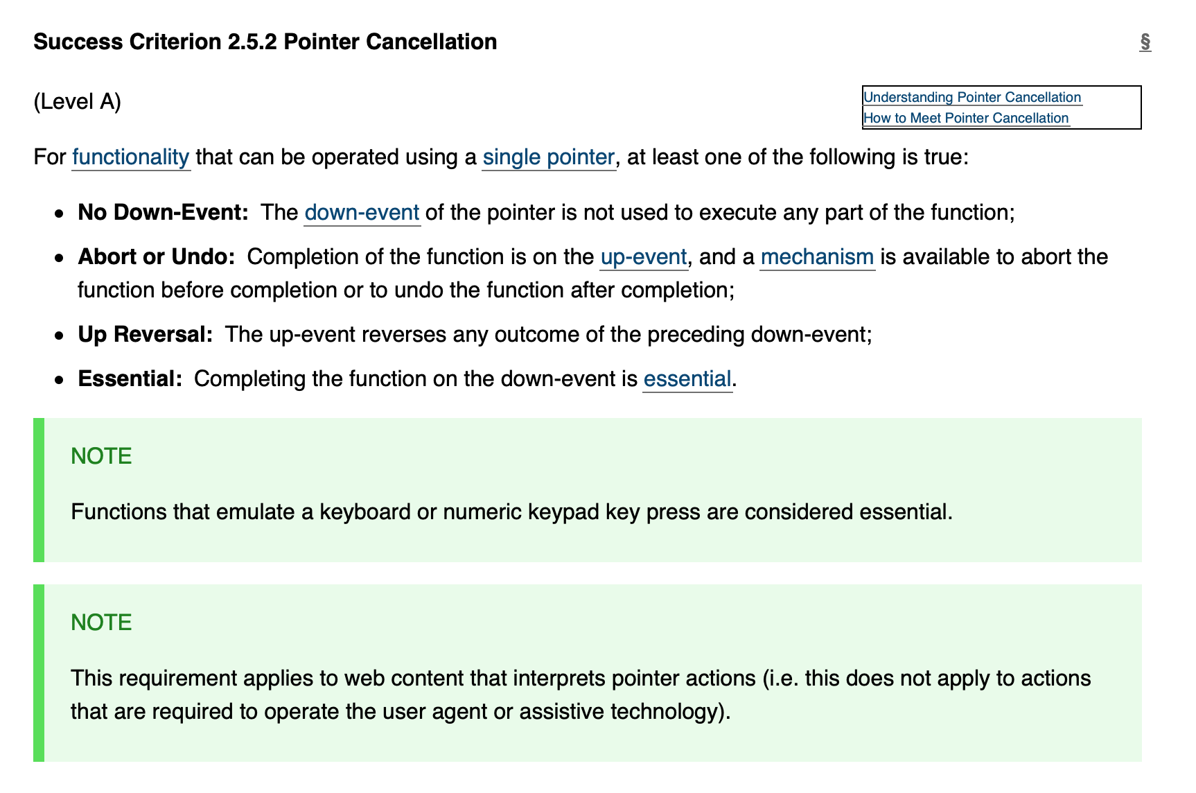
Oh, just that? Simple.
I’m going to break it down a bit more than the others. All of these except 2.5.3 come with the exception “unless it would break the site or app”. The official tag for this in the docs is that a feature is essential.
- 2.5.1: interactions like dragging or pinching (that require either multiple fingers or for the user to follow a specific path) can also be done with a single mouse pointer, without dragging.
- 2.5.2: pointer actions either 1) don’t require a click, 2) trigger when the mouse button is released and have an easy undo or 3) immediately reverse when the mouse button is released.
- 2.5.3: if a label has text on it, the name of that label (to be read by software like, say, a screen reader) needs to be the same as the text itself.
- 2.5.4: anything done by gyroscopes/moving the device can also be done within the UI, without moving the device.
- 2.5.5: pointer inputs need to be 44×44 CSS pixels minimum unless 1) there’s another input for the same purpose that already is that size 2) it’s inline text 3) the user can control the size manually.
3: Understandable
3.1: Avoid jargon and complex language. The one the WCAG guidelines probably could’ve paid more attention to themselves. Not that I’m bitter after spending days pulling this thing apart, nope. Being fair to W3, their own breakdowns are excellent Plain English, they’re just a lot of text to comb through.
3.2: The page needs to work like users expect it to work. If your big red CANCEL button is actually the PLEASE ADD ME TO YOUR MAILING LIST AND ALSO CREATE AN ACCOUNT button then you’ve failed to comply with this subsection. More broadly, it covers some common UX that users have come to take as a given: settings don’t change unless the user knows about it first, navigation works in a consistent manner across pages, no viewport or focus changes unless initiated by the user, the focus indicator doesn’t change anything.
3.3: Users should have ways to correct or avoid mistakes. This means comprehensible error alerts, and suggestions to the user for what to do next, e.g. “please click back” or “please contact support”. If money is changing hands, users should have some way—in cases or error—whether the money has gone out. This also means having a robust help system that is sensitive to what the user is doing.
4: Robust
There’s only one subsection here, and it’s that your site works on a variety of devices and viewports, plays well with assistive technologies, and generally doesn’t break if users try to do something unexpected. This ideally includes future-proofing. It’s a bit of a loose catchall for anything that didn’t get caught in subsections 1.3 and 2.5, but POU is a much less memorable acronym than POUR and it’s good to cover edge cases.
And that’s it! Or not: if you need to go deeper, you can always check the documentation itself, but I hope I’ve provided an easy breakdown and/or cheat sheet for you to refer to. If you’re in a hurry then I guess I’ll see you later, but if you’re a frontend/UX designer and you’re looking for work, consider taking a look at CodeClouds’ jobs page: we’ve got frontend developer jobs in the US, India, and New Zealand.